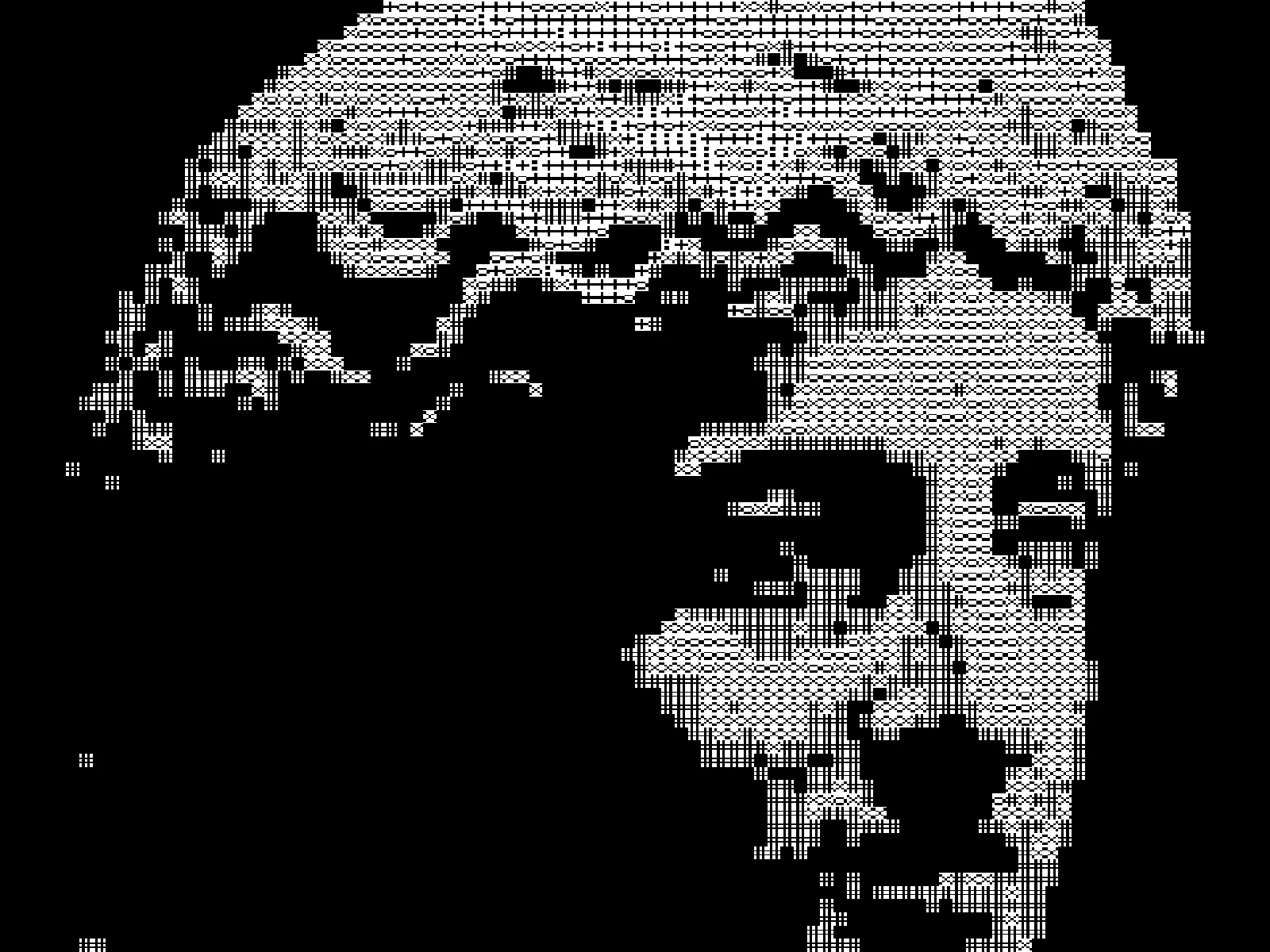
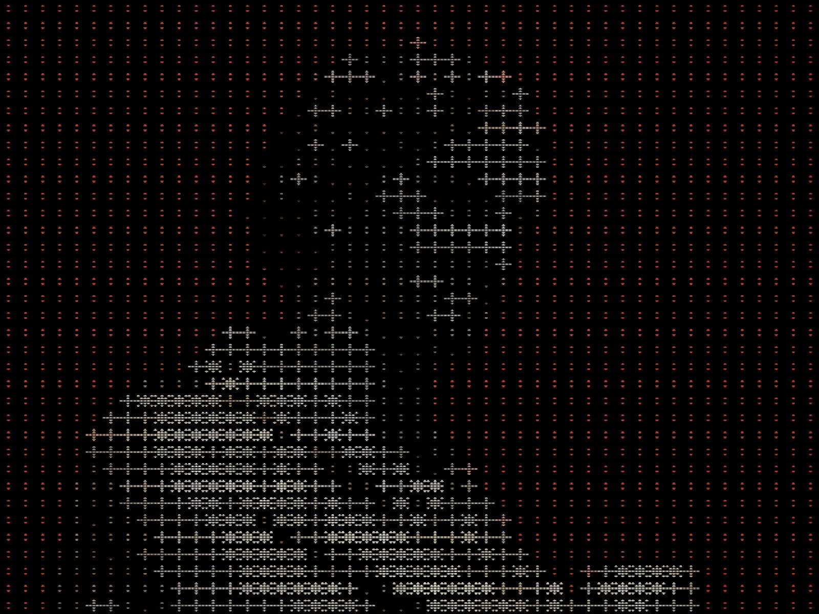
ascii color effect
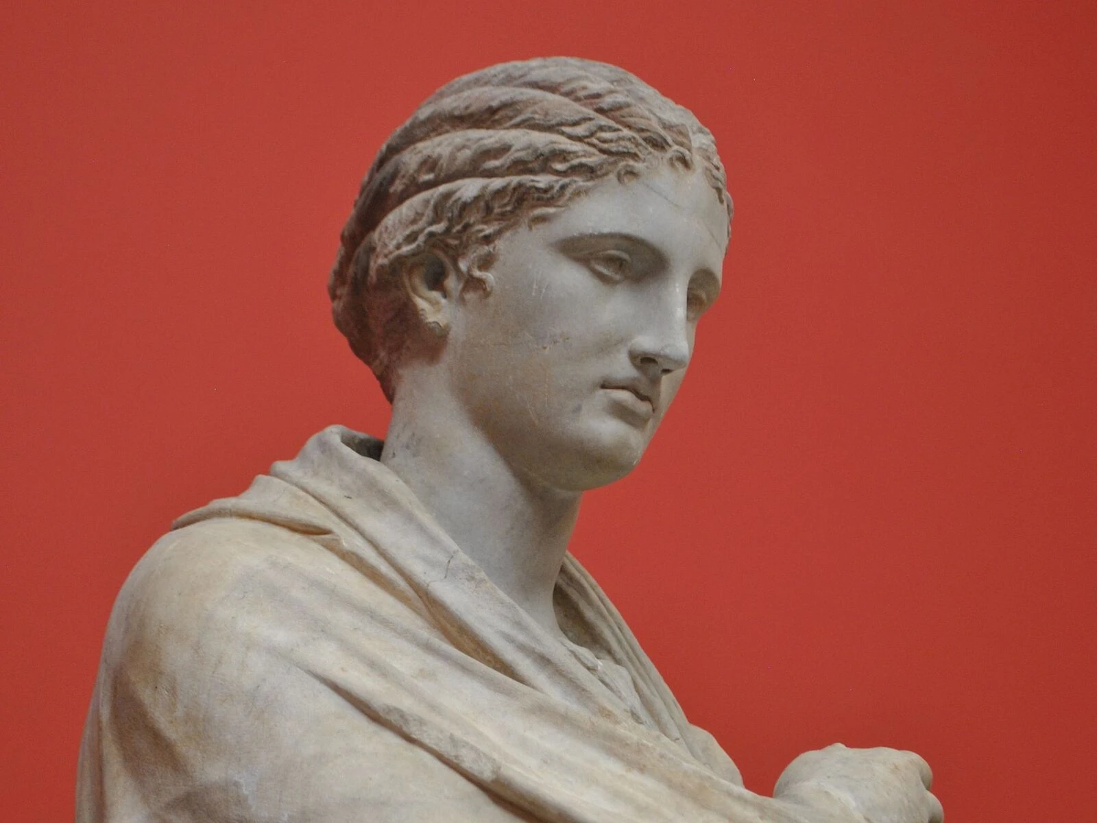
 SourceEffect
01/ ORIGIN
Plain ASCII art had only density to work with. ANSI art added colour: escape codes defined in the ANSI X3.64 standard let a terminal set foreground and background from sixteen values per character cell, and bulletin board systems ran on it through the 1980s and 1990s. Artists worked in dedicated editors, distributed work in packs, and competed in groups, building a scene entirely inside a grid of coloured characters that had to arrive over a phone line.
02/ SWEEP
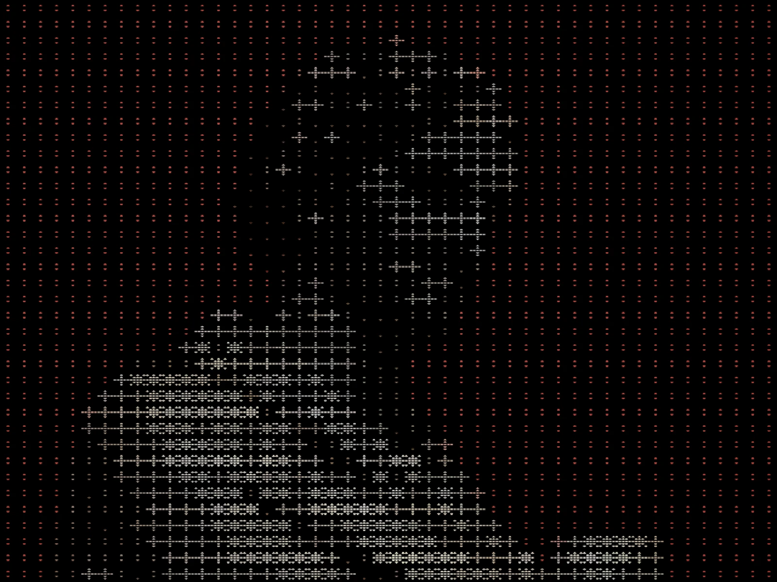
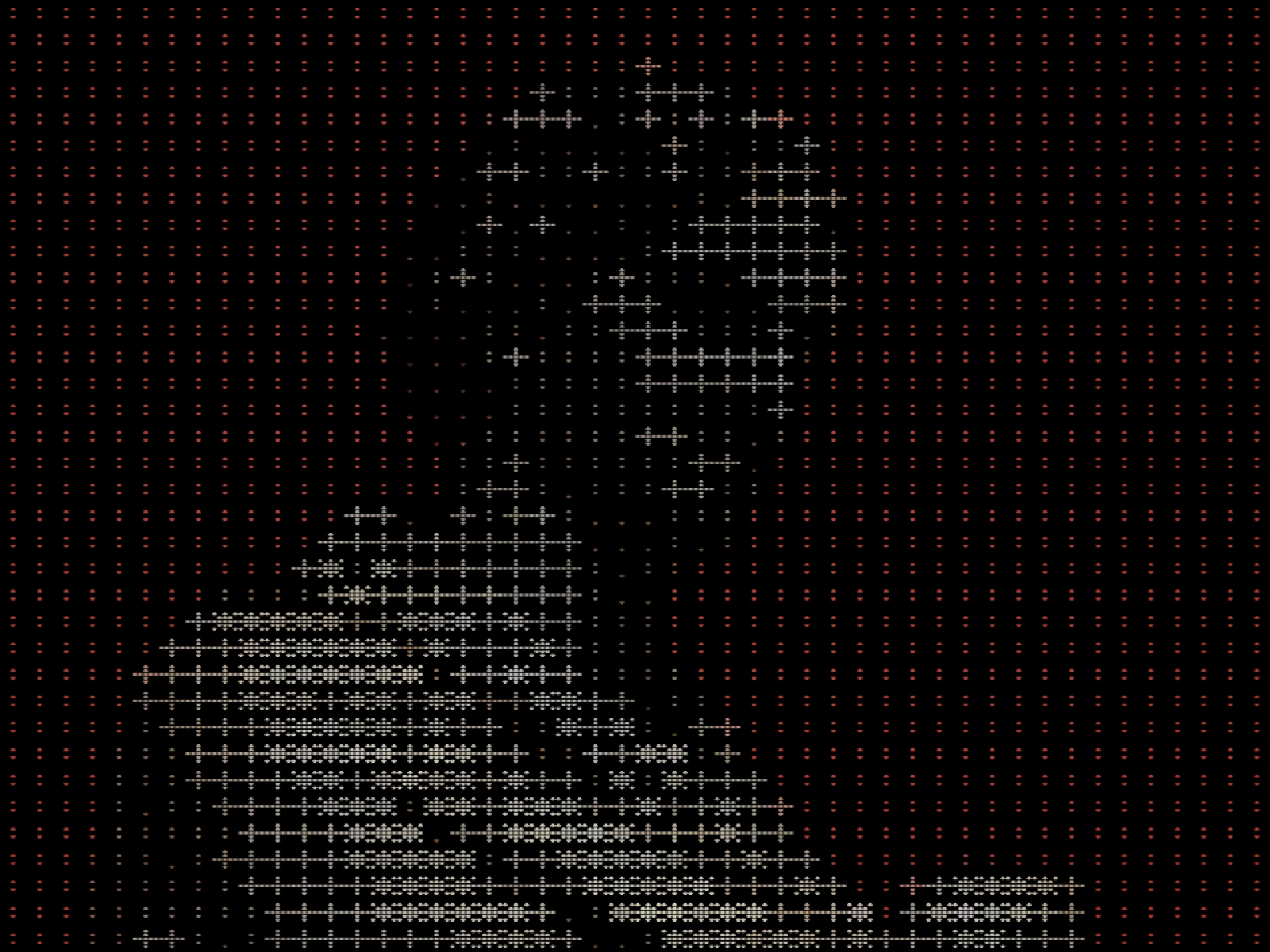
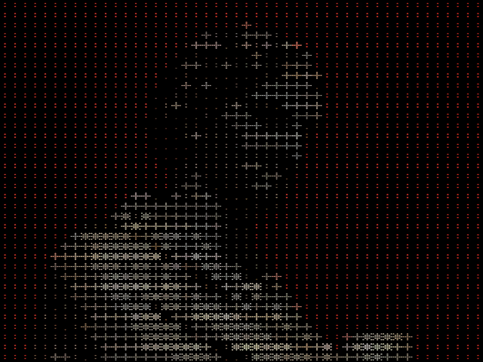
SATURATION sweep
03/ SPEC
This effect maps blocks of pixels to characters chosen by ink coverage and tints each one with the colour of the area it covers, so tone comes from the glyph and hue from the source. SATURATION runs from 0 to 1 with a default of 0.25 and scales how strongly each character is tinted, which is the entire difference between this and plain ASCII: at 0 the output is indistinguishable from monochrome. CELL sets character size from 2 to 16 pixels. Its default of 4 is tuned for a screen-sized canvas, so the previews here are rendered at CELL 10, where the glyphs are legible at export resolution rather than sub-pixel. In kott it renders in natural colour.
04/ FAQ
- What is a coloured ASCII effect?
- It rebuilds an image from text characters chosen by ink coverage, tinting each with the colour beneath it, so tone comes from the glyph shape and colour from the source.
- What is the difference between ASCII art and ANSI art?
- ASCII art has only character density to work with. ANSI art adds colour through terminal escape codes, allowing sixteen foreground and background values per character cell.
- What CELL size keeps the image readable?
- Two to four on a large export. Above about 10 the characters dominate and the subject only resolves from a distance, which suits poster use more than screen use.
05/ OUT