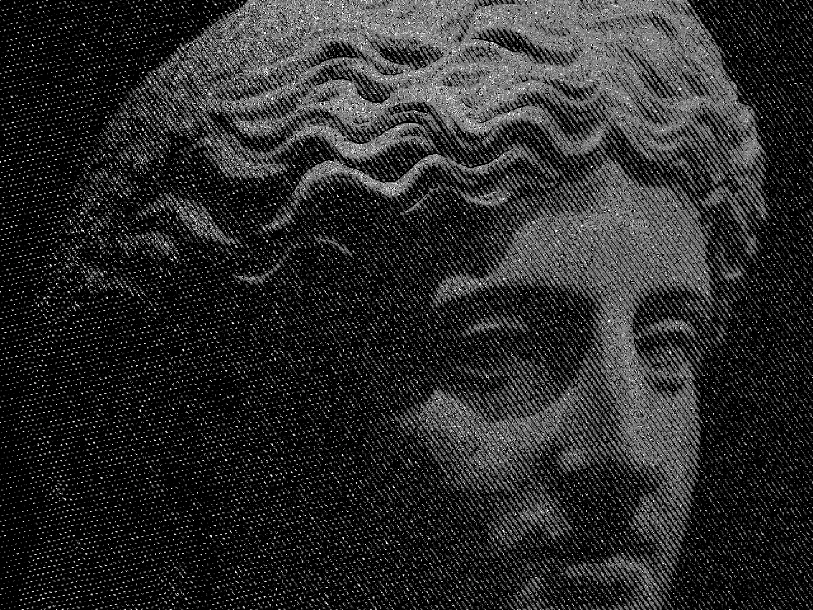
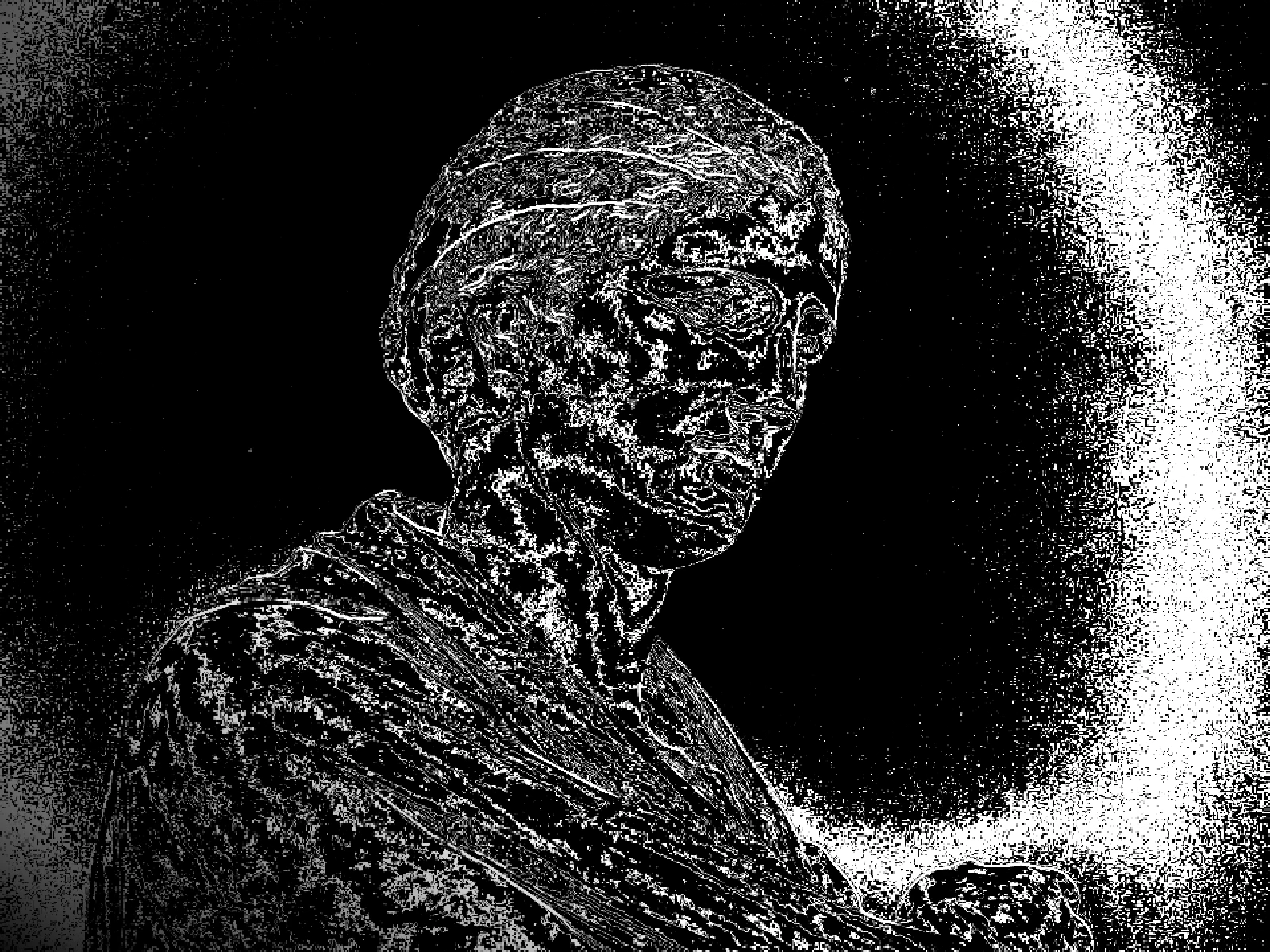
crosshatch effect
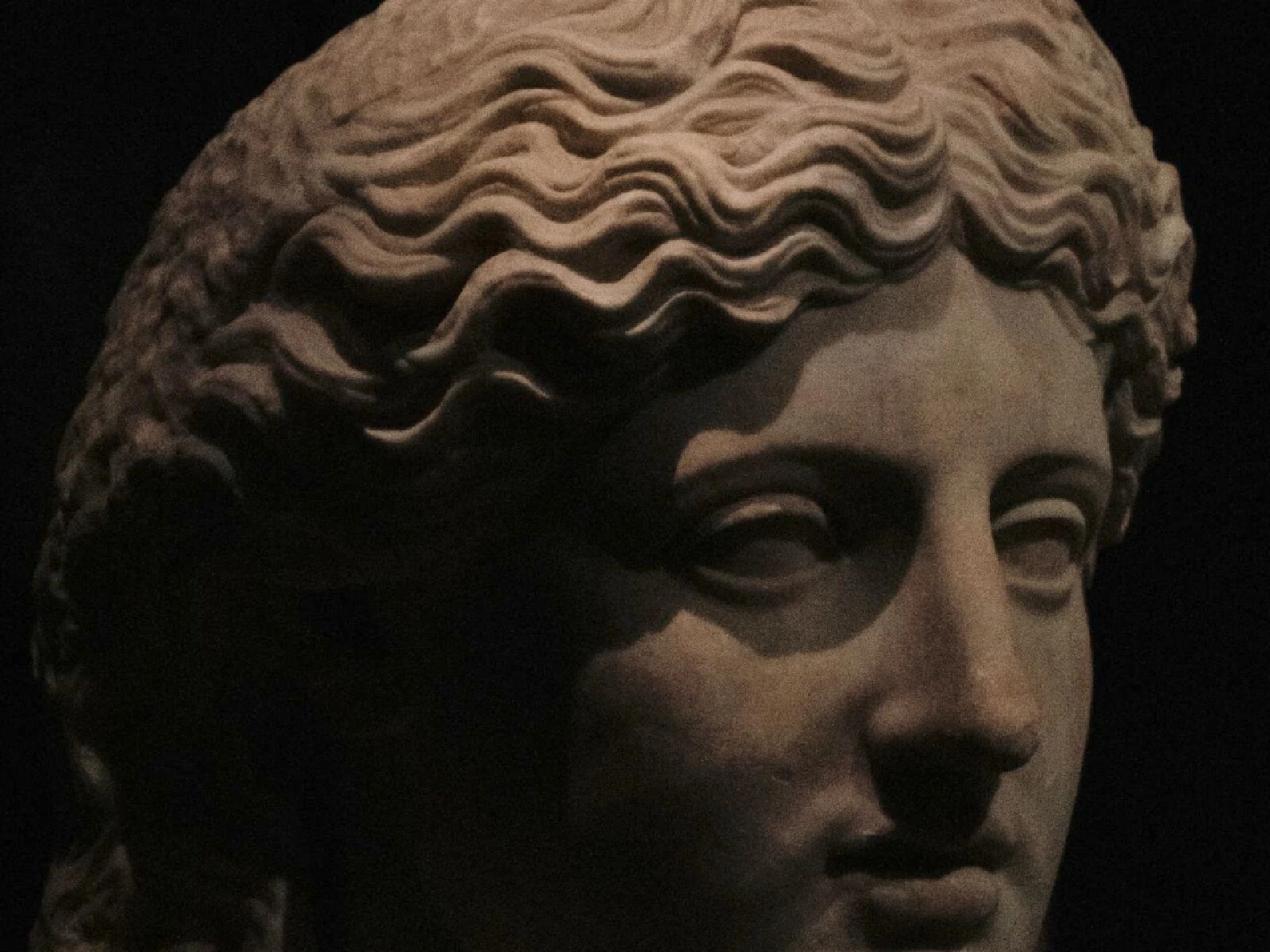
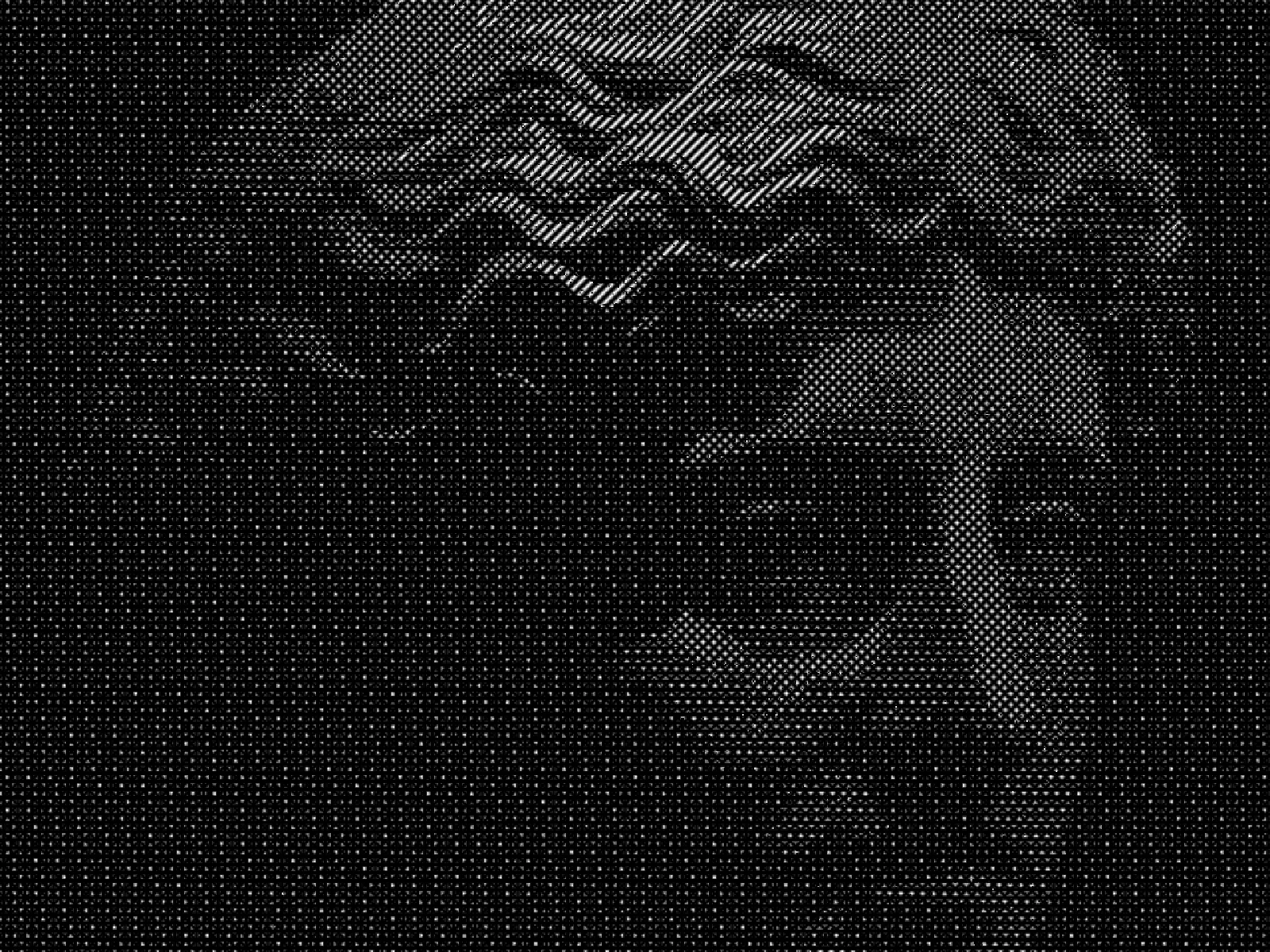 SourceEffect
01/ ORIGIN
Engravers and etchers had no grey. Ink is either on the paper or it is not, so tone had to be built from line: parallel strokes for a mid tone, a second set crossing them for something darker, a third and fourth for the deepest shadow. Renaissance printmakers turned the constraint into a discipline precise enough to reproduce paintings, and the convention outlived the technique that forced it. Technical and medical illustration still hatch by hand for the same reason.
02/ SWEEP
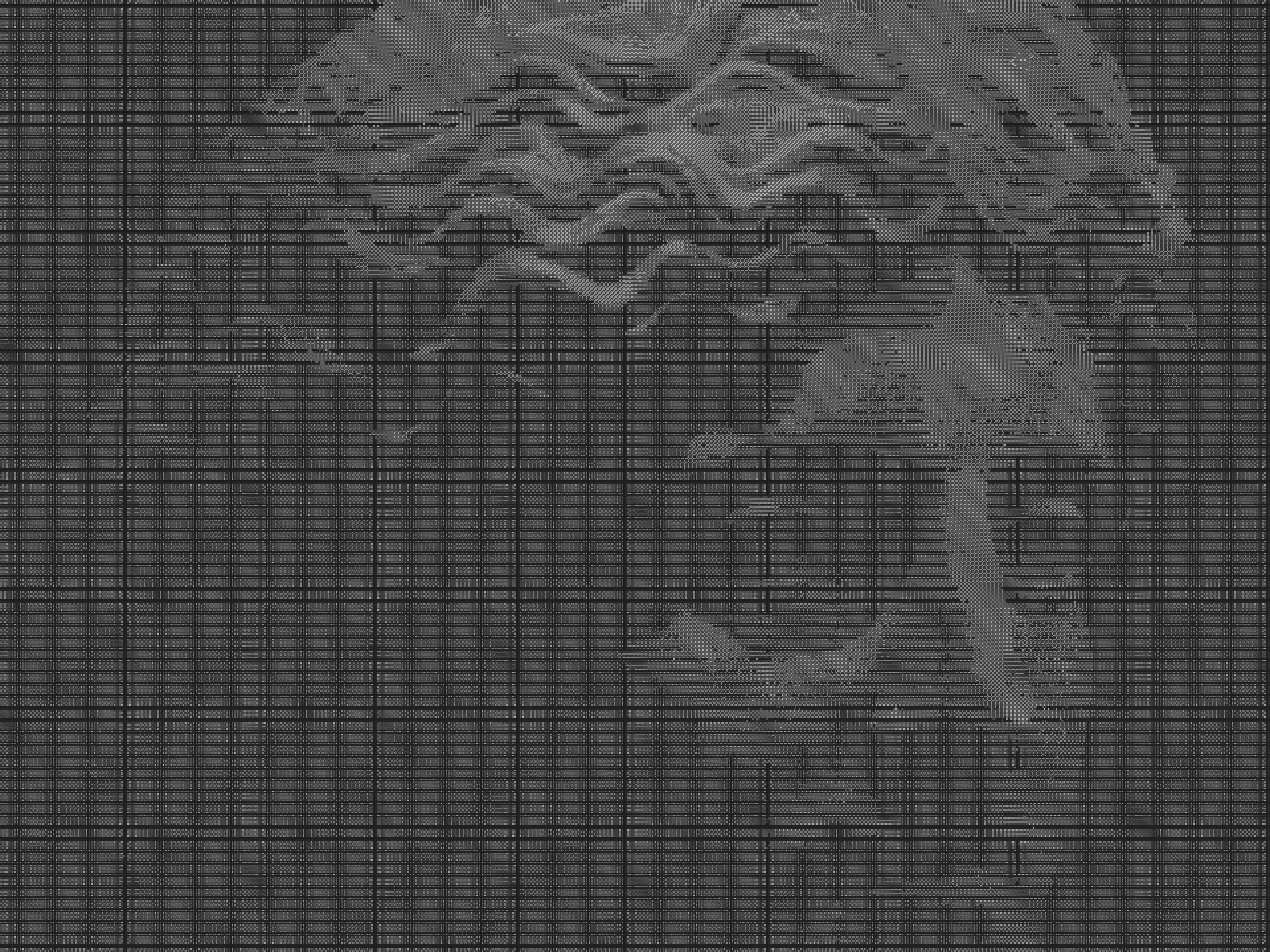
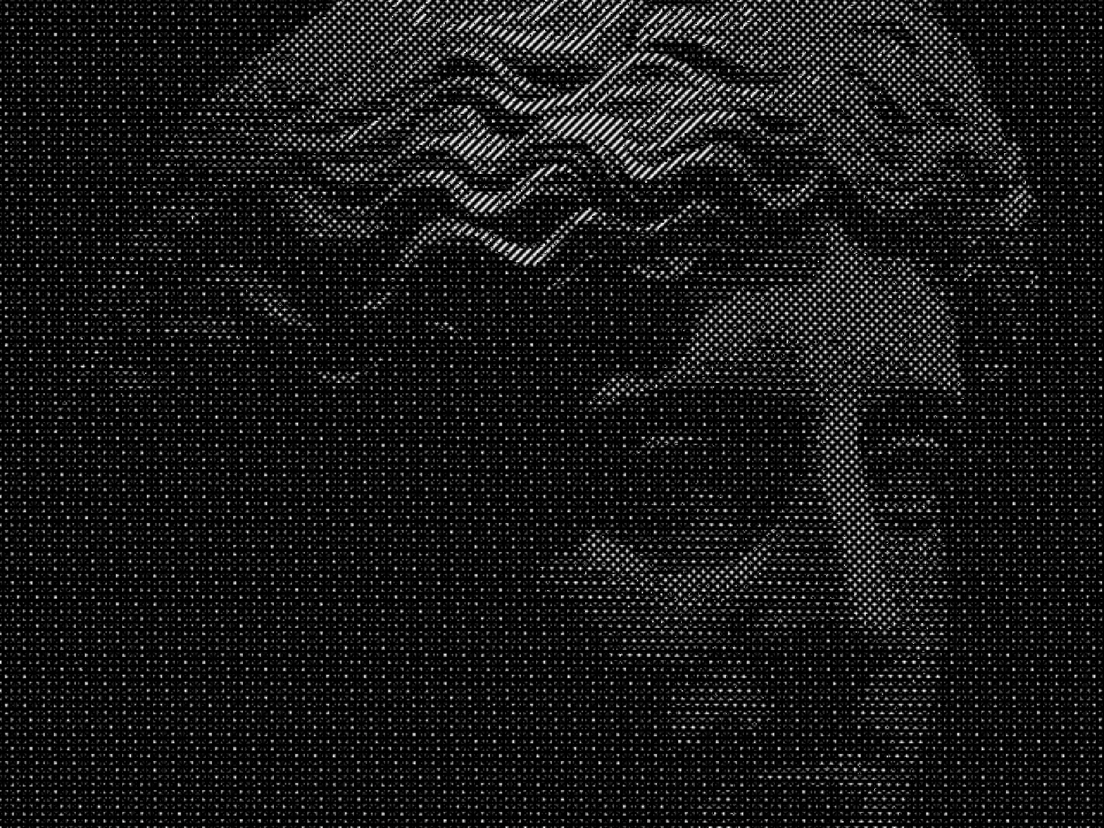
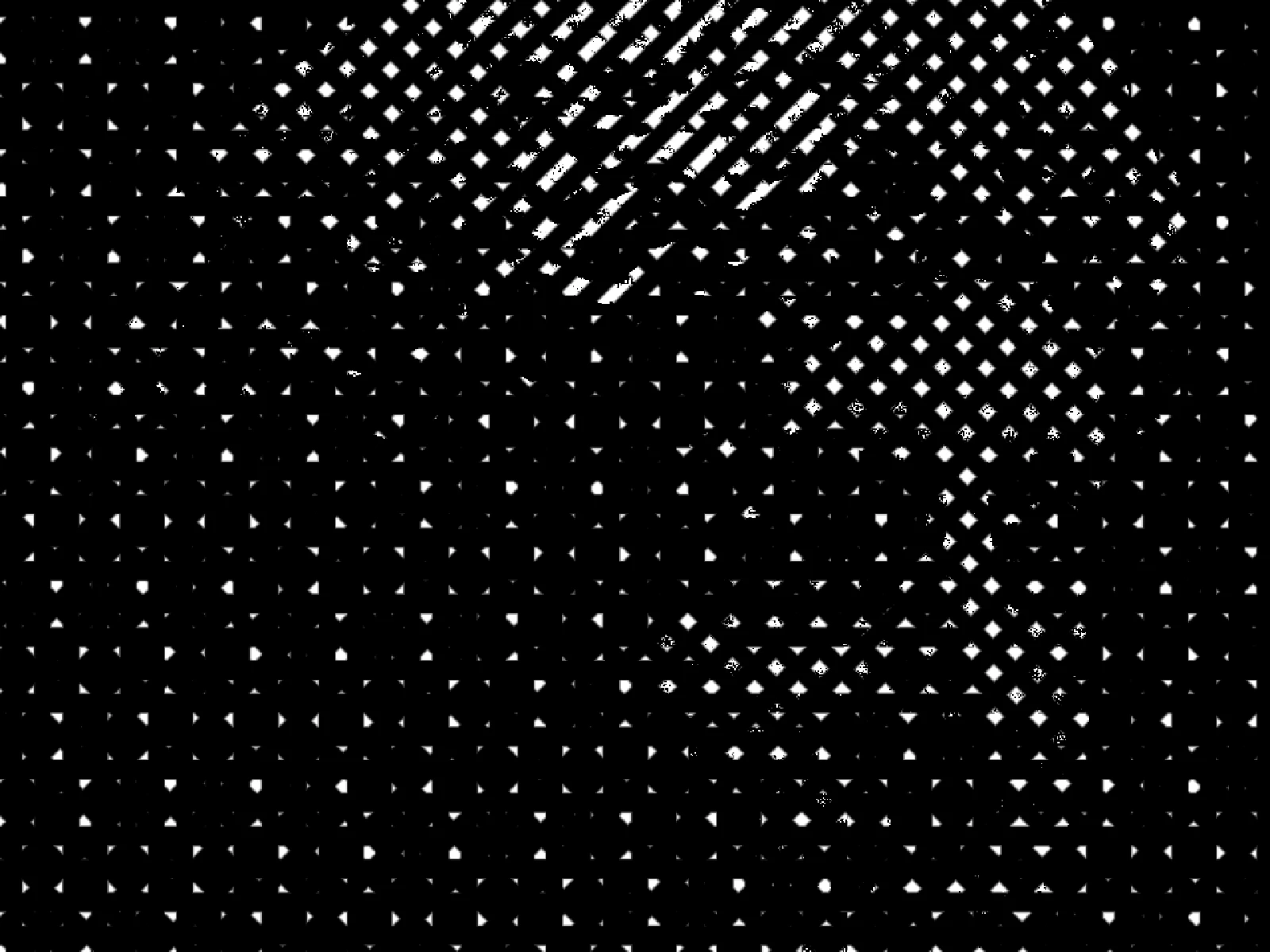
SCALE sweep
03/ SPEC
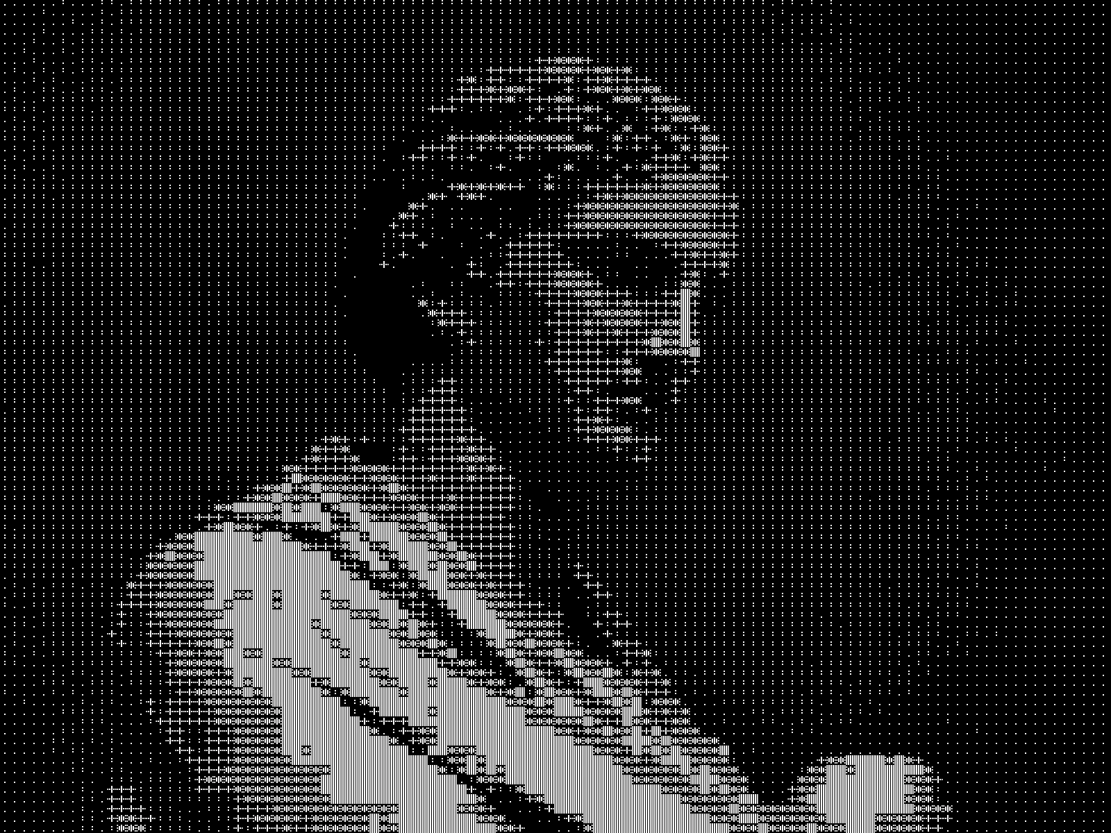
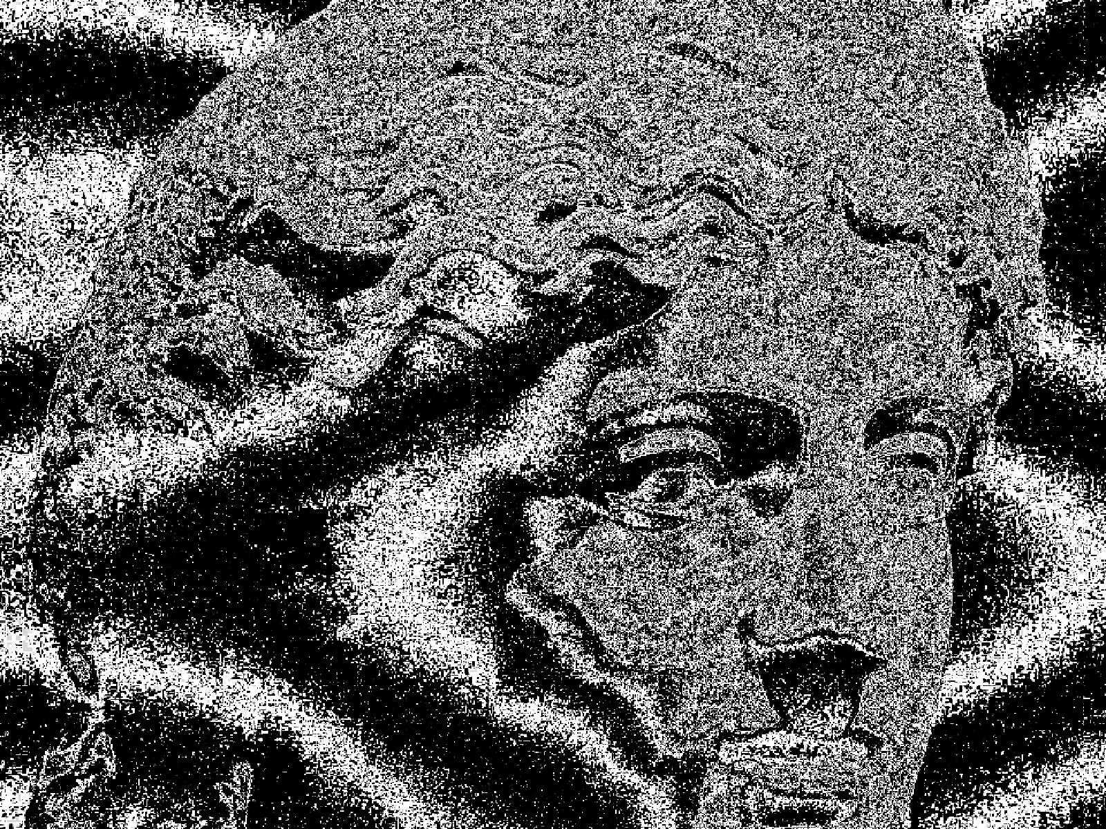
Crosshatching maps brightness to layered sets of parallel strokes at differing angles, adding a further layer as tone darkens, which is how an engraving builds shadow without any grey ink. SCALE sets stroke spacing from 2 to 24 pixels with a default of 6, and decides whether the result reads as fine engraving or as bold marker work. CONTRAST expands tone before the layers are assigned, which matters because a flat source lands most of the image on one hatch layer and loses its form. In kott the strokes are generated per pixel rather than tiled, so they stay crisp at export size.
04/ FAQ
- What is a crosshatch effect?
- A crosshatch effect renders tone as sets of crossing parallel lines, adding layers as an area darkens. It reproduces how engravings and pen drawings build shadow without using grey.
- What SCALE should I use for a fine engraving look?
- Keep SCALE at 2 to 4 on a large export. Above about 12 the strokes read as marker or brush work rather than as engraved line.
- Why does my photo lose its shape when crosshatched?
- A low-contrast source maps most of the image onto a single hatch layer, so form disappears. Raise CONTRAST above its 1.1 default, or start from an image with real shadow separation.