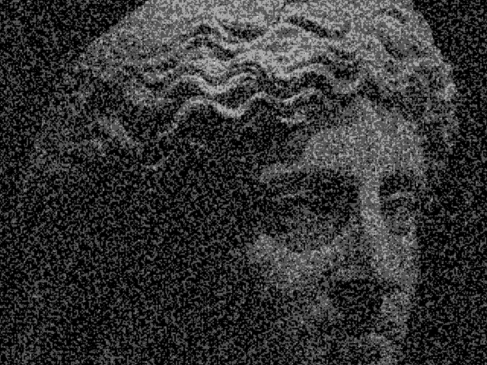
posterize effect

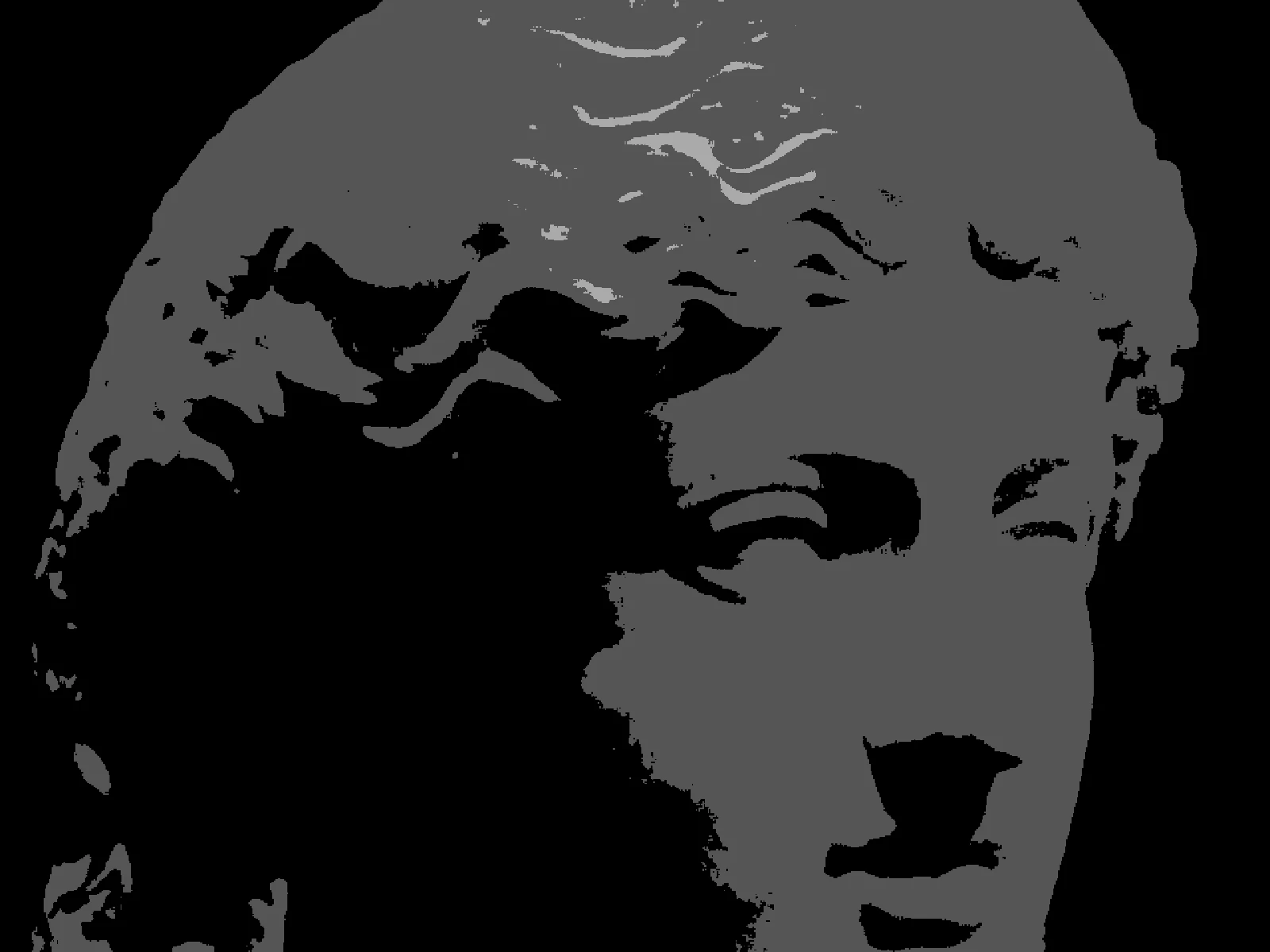 SourceEffect
01/ ORIGIN
The name comes from printing. A poster run with a handful of ink separations cannot hold a smooth gradient, so tone arrives as flat bands with hard edges between them, and designers learned to use that limit as a style. Photographers reproduced it deliberately in the darkroom with high-contrast film long before it was a menu item anywhere. The constraint disappeared with digital printing. The look stayed, because a flattened image commits to something a photograph does not.
02/ SWEEP
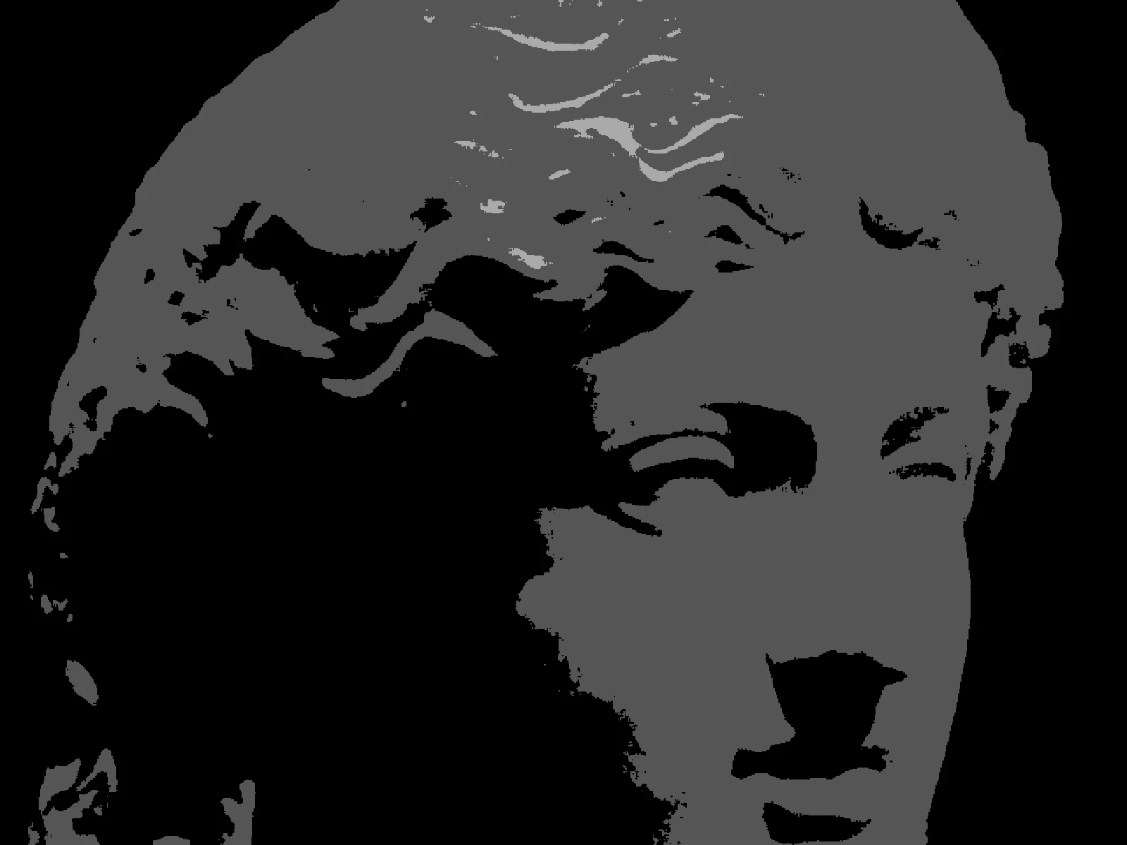
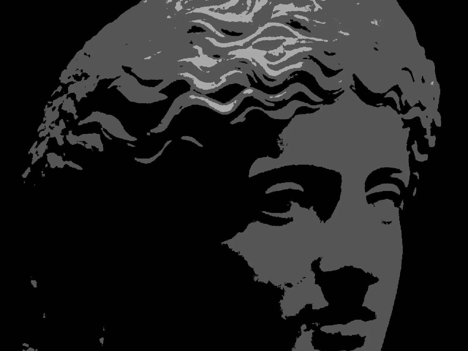
LEVELS sweep

03/ SPEC
Posterisation quantises each channel to a fixed number of evenly spaced values, so smooth gradients collapse into flat bands with visible edges between them. LEVELS runs from 2 to 16 with a default of 6 and is the control that matters: at 2 the image reduces to pure black and white per channel, and by 16 the banding is close to invisible on most sources. CONTRAST is an advanced refinement that expands tone before quantisation, which moves where the bands fall. In kott it runs per pixel, so gradients band predictably instead of breaking into grain.
04/ FAQ
- What is a posterize effect?
- A posterize effect reduces the number of tonal steps in an image, so smooth gradients become flat bands with hard edges. The name comes from poster printing, where a few ink separations could not hold a gradient.
- What LEVELS value should I use for posterize?
- Start at the default of 6. Two gives a stark graphic reduction, and anything above 12 is usually too subtle to read as an effect on a photographic source.
- What is the difference between posterize and dithering?
- Both reduce the number of tones. Posterisation produces flat bands with visible edges, while dithering breaks the same reduction into grain so the eye reconstructs the missing tone.